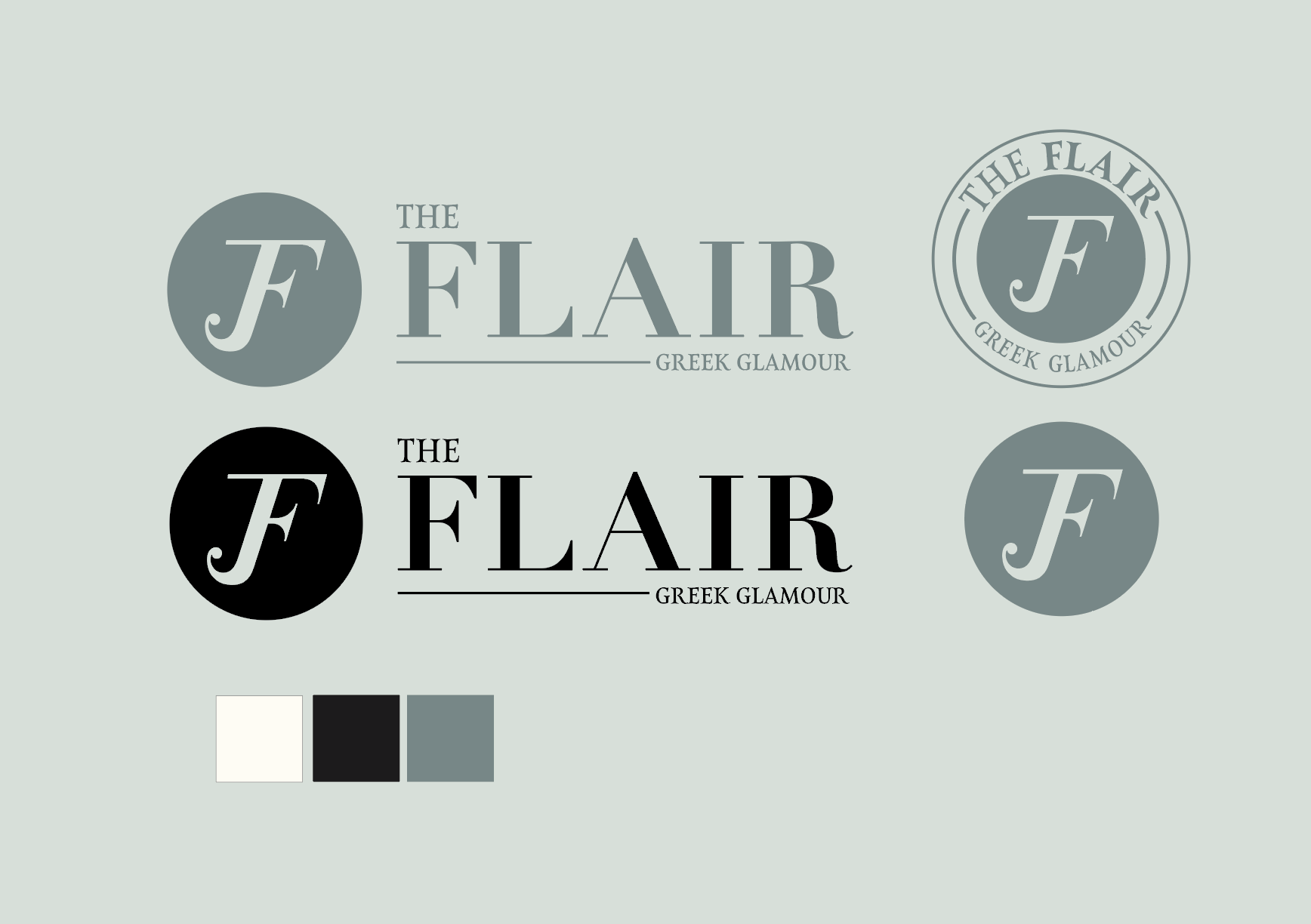
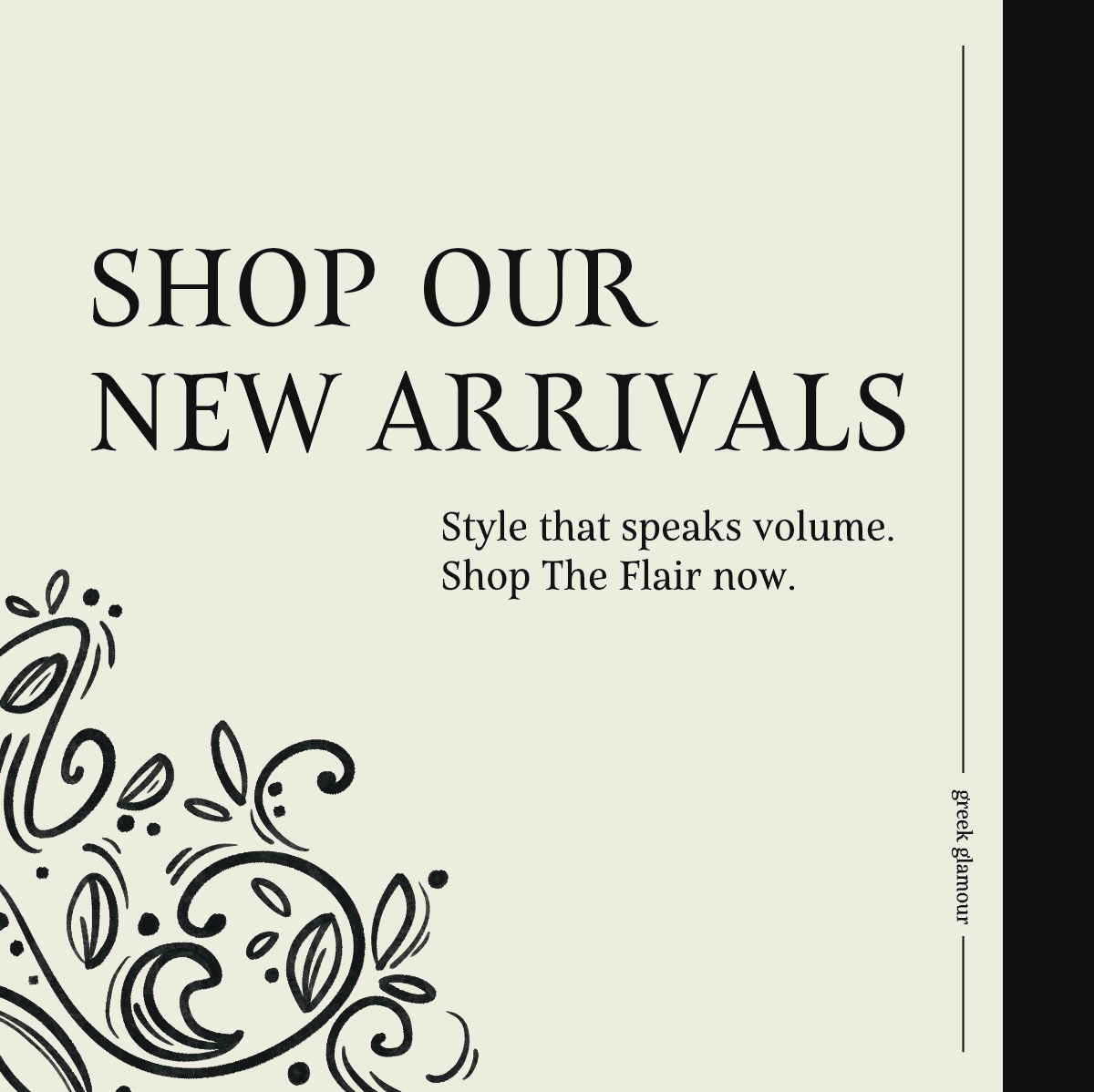
BRANDING
The Flair
Greek Glamour Branding
This was a team project where we collaborated to create a new brand identity. We were interested in creating a store where our focus was college campuses and students who need attire for formals or functions that are affordable and trendy. This store’s purpose is to make it easier for college students, specifically students in Greek life, but open to anyone who may need specific function attire. The store would sell a wide range of selections of formal and semi-formal dresses, costumes, and men’s attire. Our goal when creating this store was to focus on making the branding and design appealing to the audience they are targeting. The store’s intent is fun and eye-catching with innovative designs and creative marketing.
Instagram Marketing
For this group project, we felt that it was important to display how our brand would function on a platform such as Instagram. When creating the Instagram campaigns, I wanted to be able to keep the fluidity of the original logo style and have that motion dispersed throughout all of the ads.


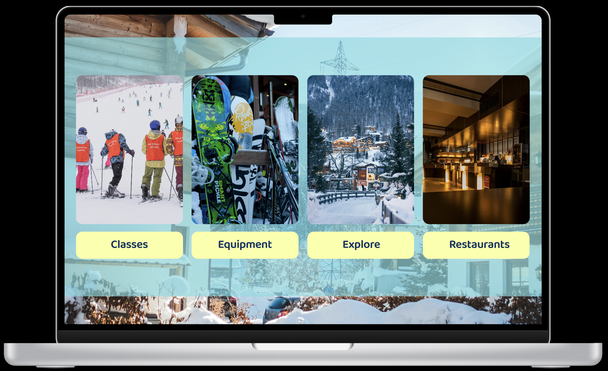
VAIL App & Website
UX UI Design
The purpose of this project was to create an app and a website that were compatible but not similar, and solve an existing issue with UX UI. The use of my app would be for people who are actively skiing or snowboarding on Vail Mountain while the website would be used for the village down below. Due to the open space of the mountain and freedom of the different assortment of trails, navigation and reliable updated information proves to be difficult to access at times. This website and app would be used for individuals who are looking for more navigational and directional assistance when they are on the mountain as well as different activities that are available for those already familiar with the mountain. In addition, this app would provide accurate and accessible wait times for chairlifts on the mountain as well as the ability to locate certain places throughout the resort. The website would provide similar benefits, but include options for exploration and an collection of classes off the mountain. Both can be used together, or both can be used separately.


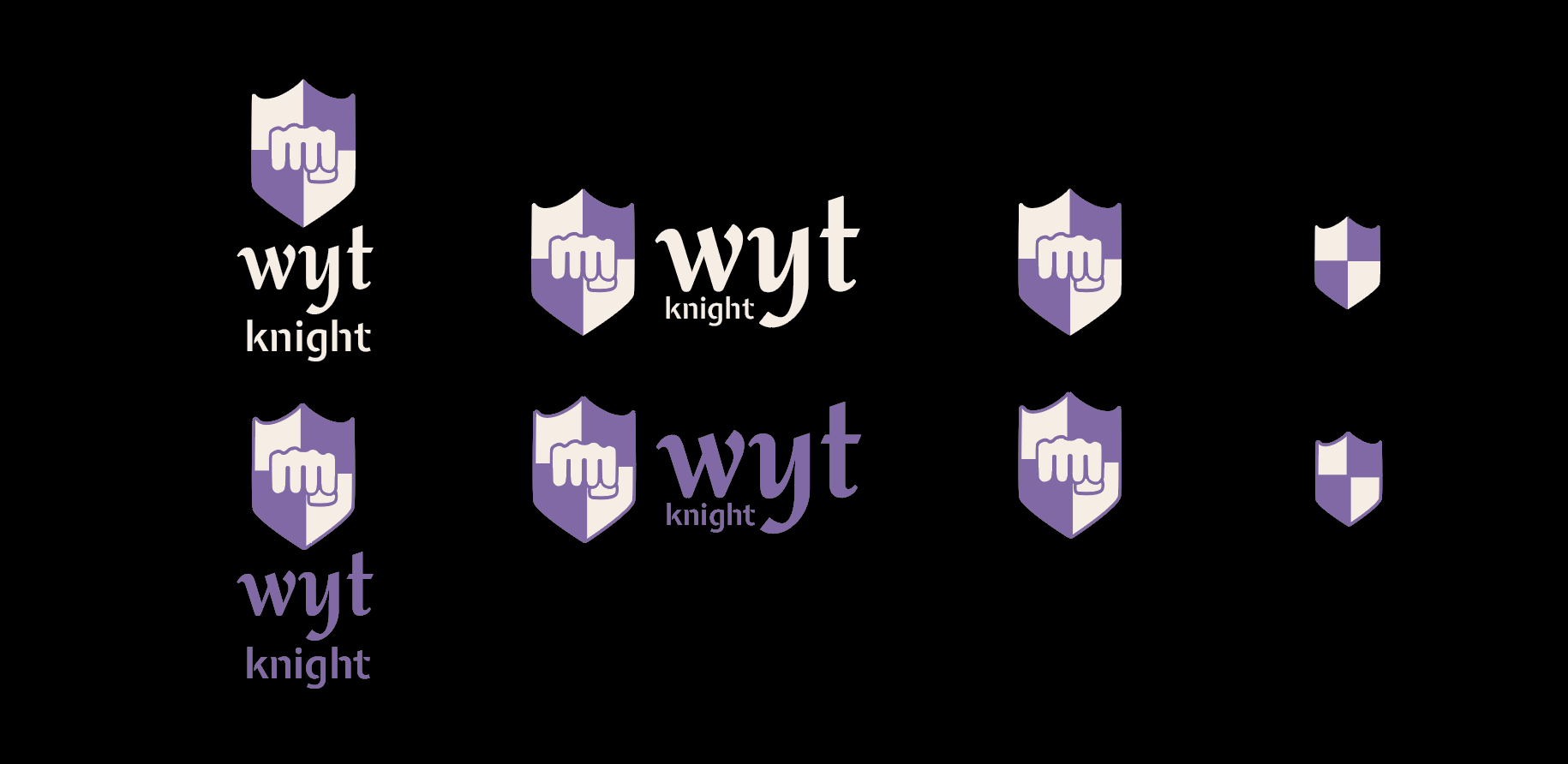
Wyt Knight
Name Branding
This project required us to use our name or pieces of our name as the company name. I took my last name, Wyatt, and created Wyt Knight. My primary goal when creating Wyt Knight was to create a self-defense company that enables people to feel protected, empowered, and ready to defend themselves. At Wyt Knight, nothing is more important than equipping each individual to defend themselves when necessary. I wanted to incorporate a safe and distinctive environment for people of all ages and groups to come into a space where they feel welcomed and invited to learn the best way to stand up for themselves.


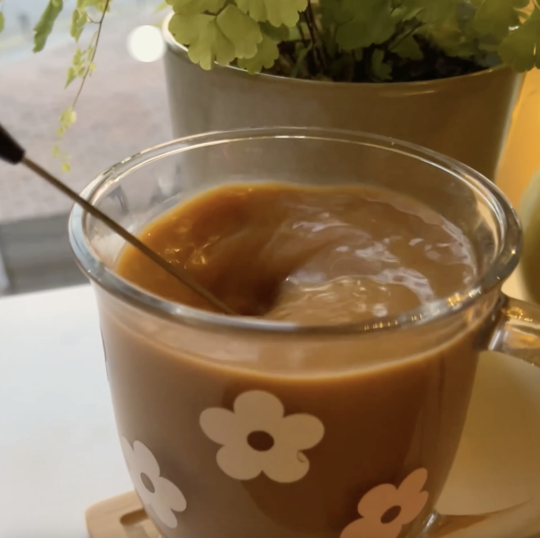
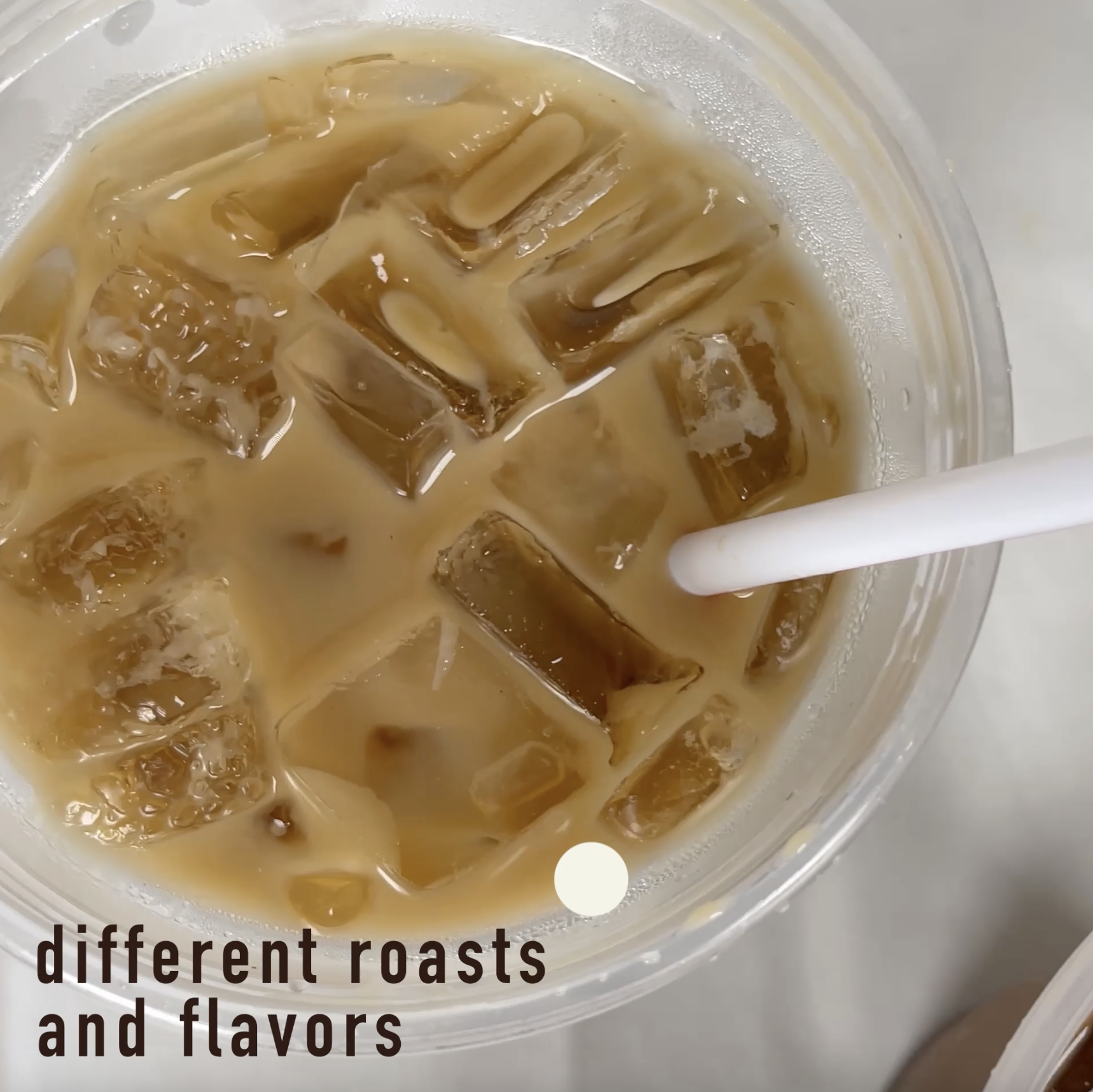
O’Henry’s
Motion Re-Branding
This project was a motion graphic, rebranding group project. My design partner and I worked on this project together in order to create updated branding for O’Henry’s Coffee House. We wanted to keep O’Henry’s original, vintage feeling while also making sure that it looked more modern as well. The color scheme selected was influenced by their current color palette in addition to more aesthetically pleasing colors that fit within the branding. When creating the reels for the project, I wanted to be able to guide the eye along with a circle that would eventually transition into the new logo at the end. The logo begins as a circle which then forms into a coffee cup with an “h” as the steam before revealing the logo as a whole.